Jobcenter Berlin-Mitte
App Redesign


PROJECT
Jobcenter
ROLE
UX Designer
UX Researcher
TIMELINE
4 days
TEAM
1 UX Designer
Overview
Introducing the new and redesigned Jobcenter Berlin Mitte App – a digital gateway to seamless access to Arbeitsagentur's services in Germany. Whether users are exploring employment, education, entrepreneurship, or basic security, the app provides a user-friendly interface for quick information retrieval. Stay updated, communicate through the Digital Portal, and track submissions effortlessly with the redesigned UX/UI, ensuring an efficient, personalized experience for all. The simplified journey starts here.
Sneak Peek Protoype
Before we start with the UX research, I will present a video that demonstrates my prototype. As we go through the presentation, I will explain my design choices and the reasoning behind them, sharing insights along the way.
Style System
The redesign focused on enhancing the Jobcenter App's readability and accessibility. Corporate Design Colors from the Original Jobcenter App and the Arbeitsagentur Germany were integrated, ensuring a consistent visual experience. The font, Poppins, was selected for its modern aesthetic and improved legibility. Adjusting font sizes catered to users with disabilities, fostering a barrier-free and user-friendly interface. User testing confirmed positive feedback, validating the success of the approach in creating a visually cohesive, accessible, and engaging experience.
#8E8E8E
#B30920
#E10103
#262626
#FFFFFF
Poppins
Aa
General Heuristic Evaluation
The original app faced significant design inconsistencies, evident in the varied setups, colors, and icons across different pages. The color palette lacked cohesion, with instances of sudden shifts like the mismatched yellow on the "She Can" page. Furthermore, the presence of large, hard-to-read text chunks impacted the overall readability and user experience. The redesign aimed to address these issues, introducing a cohesive design language, consistent colors, and improved text legibility for a more unified and user-friendly interface.
Please click on the carousel-arrows below to see the redesigned screens!
Original
Redesign

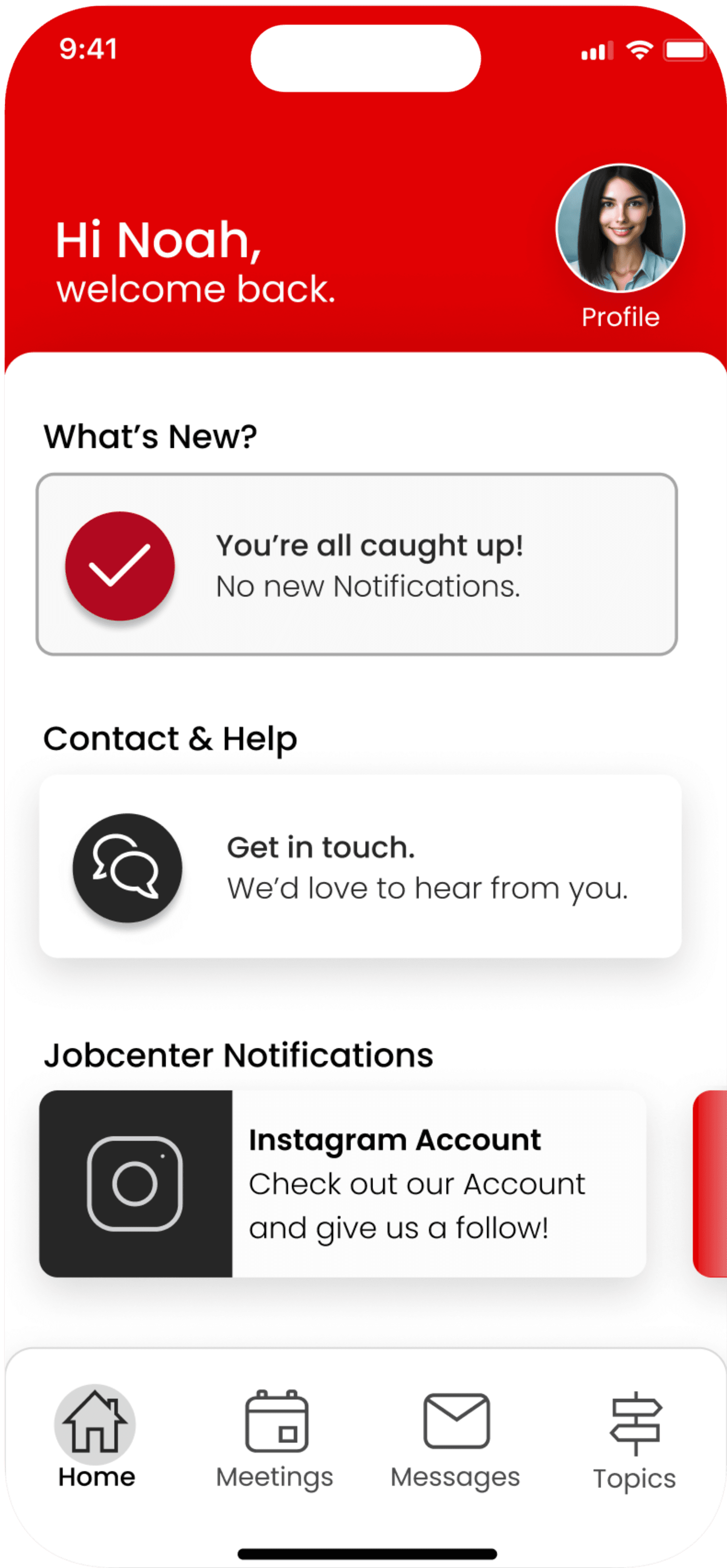
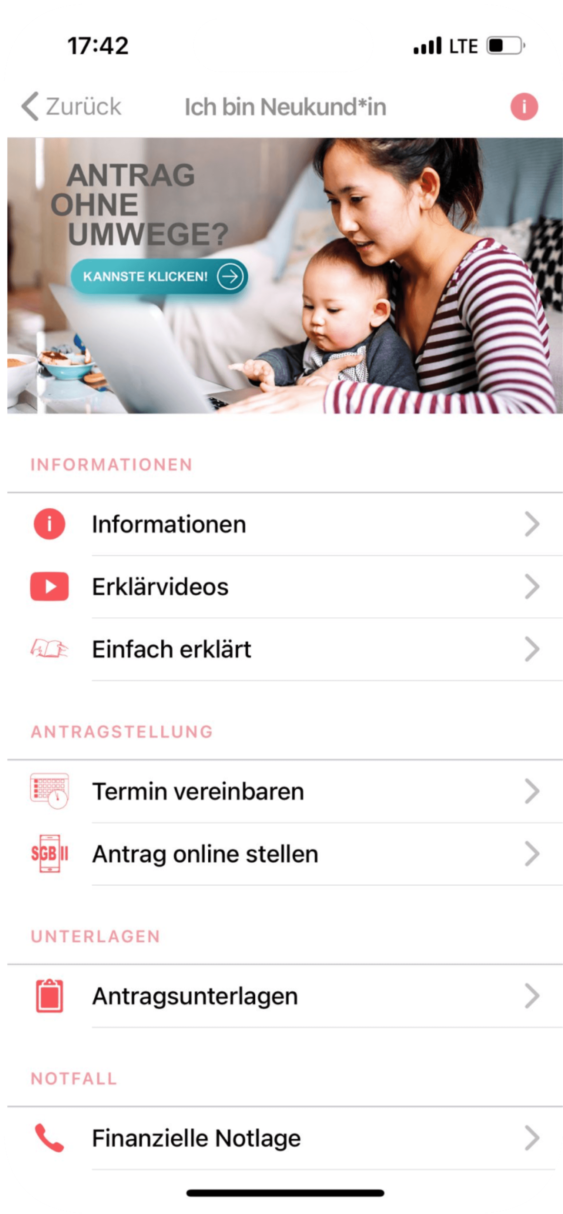
Before:
No initial login screen, German-only interface, lack of navigation bar, ambiguous icon descriptions, inconsistent icon designs.
After:
Introduced clear login screen, multilingual support, streamlined navigation bar, descriptive icons, and a consistent design language, enhancing user-friendliness and inclusivity on the Home Screen.
Home Screen
Original
Redesign

Before:
No profile option for managing personal information.
After:
Introduced a Personal Area for users to store and manage their data, personal information, documents, and settings in one accessible space.
Profile Screen
Redesign
Original


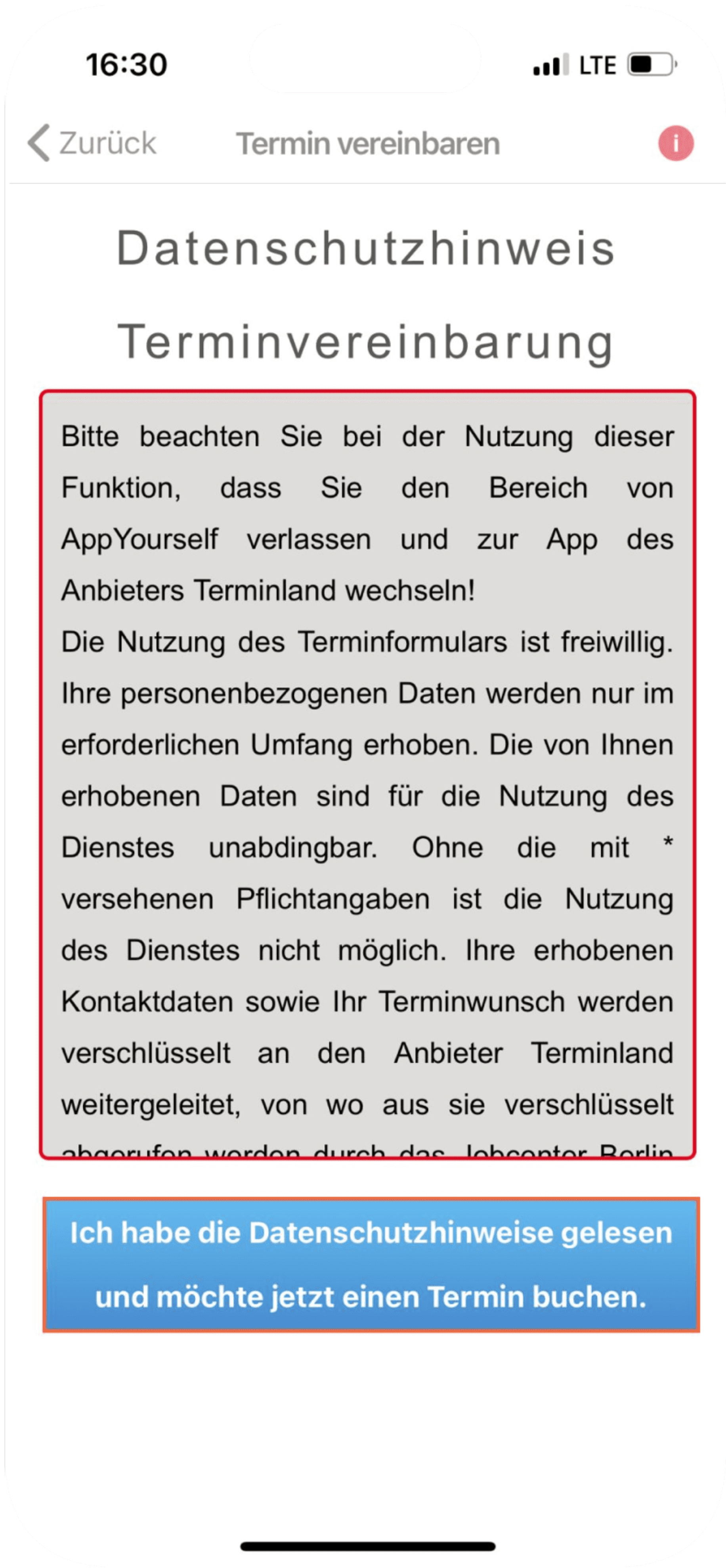
Before:
Large screen with non-corporate colored Terms & Conditions, followed by confusing, non-intuitive screens with small text and images.
After:
Redesigned for clarity, the Meetings section is now divided into "Coming Up" and "History." The first screen displays upcoming appointments and allows booking, while the second provides a clear history of past meetings.
Meetings
Redesign
Original


Before:
The original design lacked the ability to write messages directly in the app or view the history of correspondence.
After:
Redesigned for user interaction, the messaging system now displays new messages prominently, offers easy access to ongoing and past conversations, and features an intuitive interface for composing and responding to messages.
Messages
Redesign
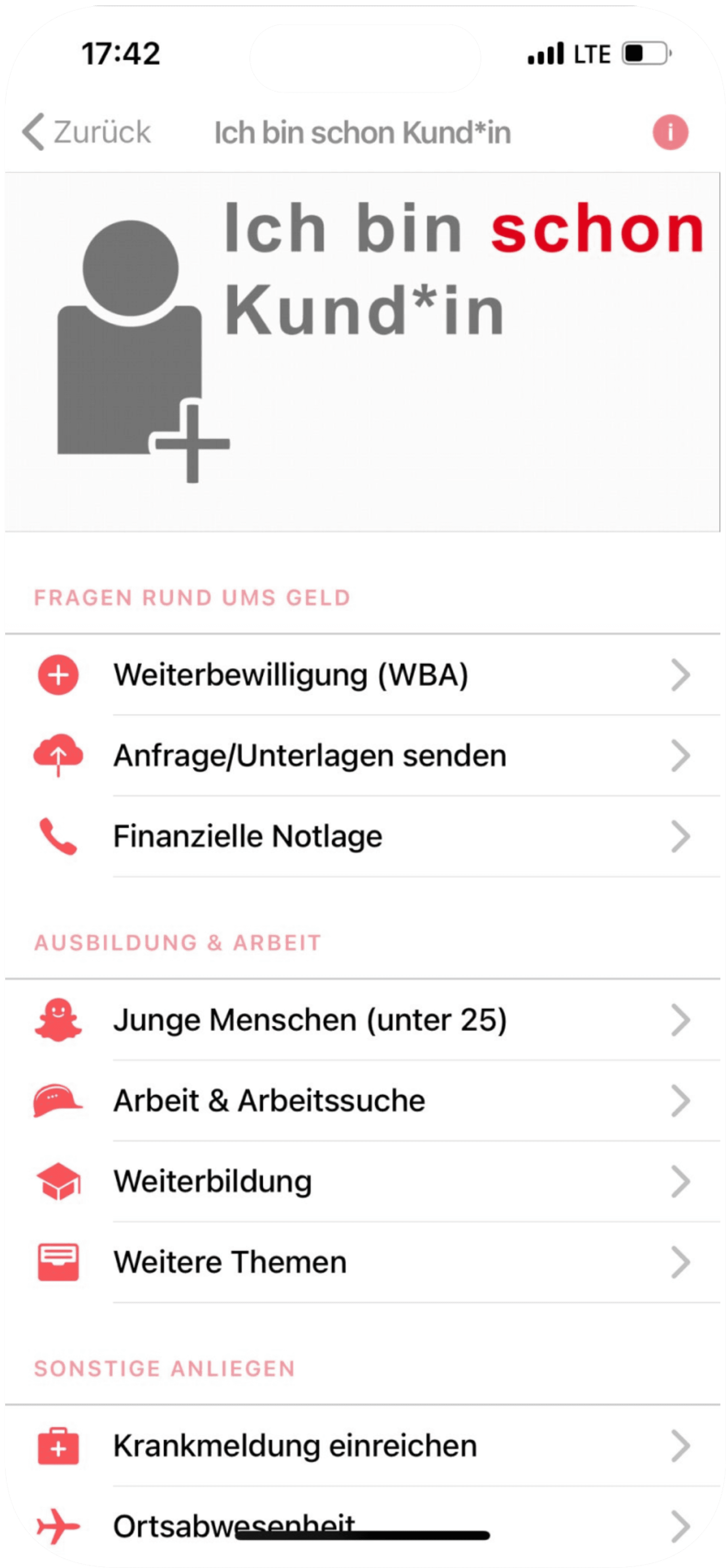
Original
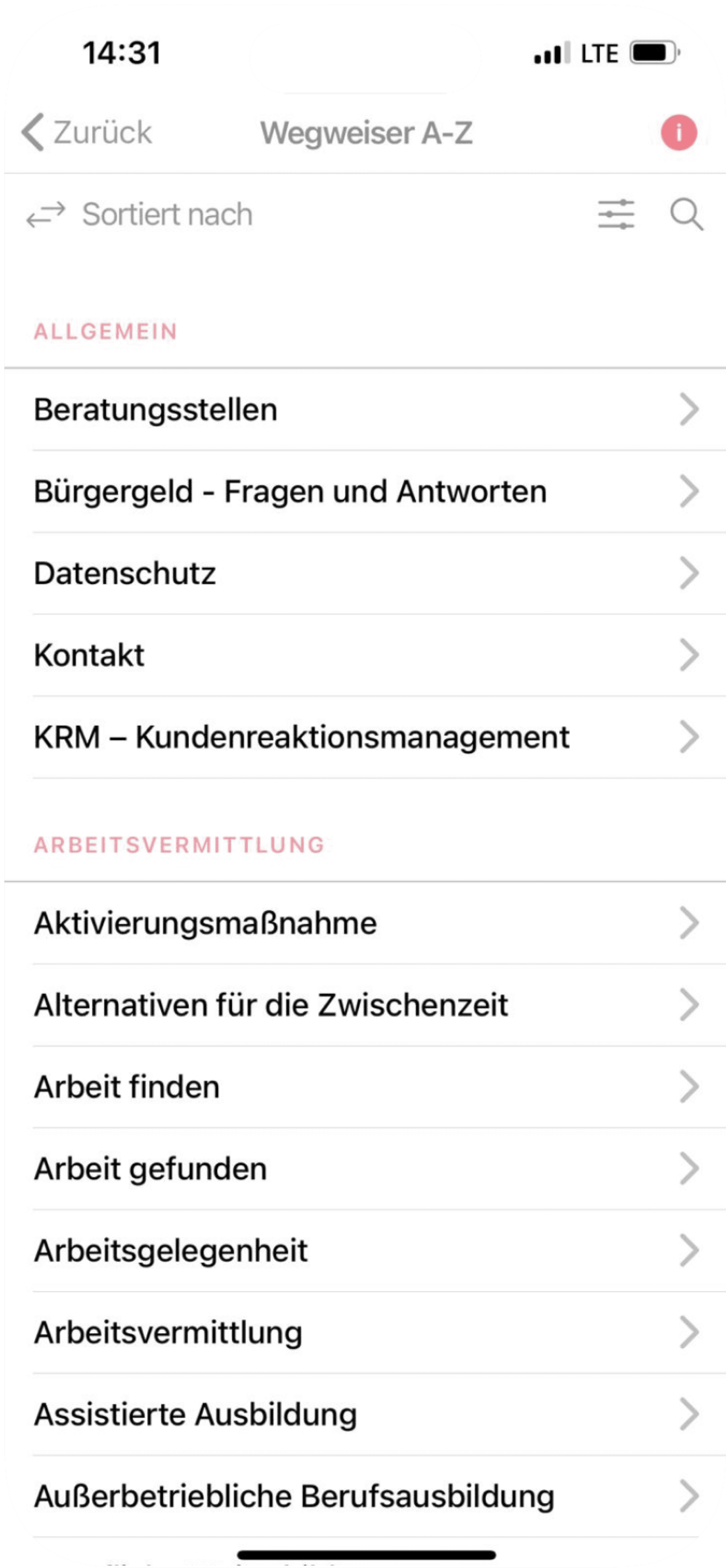

Before:
The original design presented a cluttered screen with unclear descriptions of the section. The filter function was ineffective, failing to provide accurate topic sorting.
After:
Redesigned for clarity, the Topics section now offers a clean interface with clear descriptions and an efficient search bar for easy topic navigation.
Topics
Usability Testing
During the Usability testing, seven participants were tasked with completing eight key actions using the talking aloud method. Each testing lasted about 30 minutes in total.
The majority successfully accomplished the assigned tasks independently, while a few required minimal assistance. Overall, the findings suggest a positive and user-friendly experience.

User Feedback
Following the usability test, feedback was sought from the users. The subsequent presentation features direct quotes from the users, organized by relevant topics.
UI/Design
Color combination
Nice User Interface
Not overwhelming
Few elements used
UX
Easy to use
Works well
Easy to navigate
Accessibility
Big font size increases readability
Big ocons used
Language & Communication
Available in English
Use of friendly language
Functionality & Efficiency
Only the information that is needed
Reduces stress of bureaucracy
What did the users like?
What did the users not like?
Home Screen
too general
no language change option
Profile Page
not clear enough where to find
grey background could make it seem like the profile is deactivated
Wordcloud
Furthermore, participants have been asked to describe the app in three words. The wordcloud displays what the user said and how often a word has been used.
Clean
Smooth
Clear
Fun
Quick
Minimalistic
Simple
Intuitve
Nice
Friendly
Easy
Structured
Functional
Conclusion
Incorporating corporate colors can be challenging but is crucial for maintaining a coherent corporate identity image. Redesigning an entire app and making substantial changes can indeed be a difficult task. However, as UX designers, we don't always need to reinvent the wheel. Therefore, I chose to explore apps with a good user experience and utilized elements from them for my redesign. This approach was particularly helpful since it was my first time redesigning an app.
Let’s work together!
Jobcenter Berlin-Mitte
App Redesign
Coming Soon
Available in Desktop Version
Let’s work together!
Let’s work together!