The Juicery Berlin
Website Design


CLIENT
The Juicery Berlin
ROLE
UX Designer
UX Researcher
TIMELINE
9 days
TEAM
4 UX Designer
Overview
Ever wondered what it's like to build a website from scratch for a juice spot in the heart of Berlin? No styling, no colors – just pure creative chaos. Our journey was wild, filled with late-night brainstorming and Design Thinking sessions that took unexpected turns. Picture this: we sat down with the owner, a soulful human who turned a love for juice into a thriving spot. The challenge? Crafting a website that's not just a boring e-commerce joint but a real, vibrant reflection of The Juicery soul. We'll spill the (digital) juice on how we navigated the unknown, interacted with real customers, and came up a digital experience that feels as real as a sip of freshly squeezed juice. Ready for a taste of the best Berlin's juices? Let's dive in!
Sneak Peek Protoype
Before we begin the research, let's take a look at what we have created with this video of my prototype. Throughout the presentation, I'll explain my design choices and the thought process behind them, offering insights as we go along.
Competitor Analysis
Berlin is such a foodie paradise, and you'll find plenty of spots similar to The Juicery around town. After chatting with the owner and soaking in the vibe during our client interview, and diving into our own research, we put together a Competitor Analysis to really understand where we fit in the mix.
Traditional
Innovative


Luxury
Value

User Research
We conducted a series of insightful user interviews on site at The Juicery with actual customers. The individuals were between the ages 25 to 40, with an active lifestyle and a strong emphasis on well-being. Our participants showcased a deep-rooted social and environmental consciousness, coupled with a genuine appreciation for high-quality products. Interestingly, they prefer the tactile experience of visiting shops over online ordering, highlighting the significance they place on aesthetics and the overall appearance of their chosen products and environments.
Here are some actual statements of the participants:
“I like to take care of myself and the planet”
“I really like the smell of the place, it is delicious”
“I come here to treat myself”
“Sugar is a big challenges planted into our brains”
“it is not only for a taste, but also for my life like the nutrients, healthy food, clean, good ingredients”
Even if people prefer to go to the The Juicery on site, it is still very important to have an appealing online presence.
We took this into account and therefore our goal of this website was not to be an e-commerce platform but rather to showcase the products and the brand values in a compelling way.
User Persona
Based on our user research and the information we gathered in the client interview, we put together a user persona:
Healthy Enthusiast
“Well you are what you eat, and I’m a person that cares about taking care of myself, and the planet”
Main Goal
They're all about feeding their body, mind, and soul with good food and good choices.
Goals
Prioritizing a diet rich in essential nutrients, vitamins, and minerals to support overall health and vitality.
Seek smoothie stores that are environmentally conscious and contribute positively to the planet.
Learning more about the nutritional benefits of different ingredients used in smoothies, staying healthy
Pain points
Lack of healthy options in Berlin.
Desire for more establishments offering nourishing choices.
Prefer face-to-face interactions over online orders.
Expectations & needs
Seeks a lifestyle centered around health, preferring nourishing food options and engaging in activities that contribute to overall well-being.
. A commitment to using high-quality, fresh, and locally sourced ingredients.
. Willing to spend money in change of good products and experience.
Problem statement
Now that we finished our research and created a persona, we defined a problem statement for our project.
The Juicery doesn't have a working website, making it hard for people to get information or connect with the brand online. To fix this, they need a new, user-friendly website to be more visible and engaging on the internet.
Style Guide
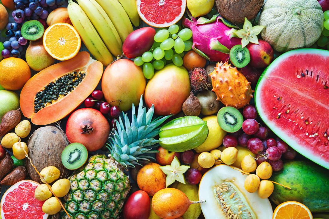
The Juicery Berlin e-commerce color palette embodies vitality, freshness, and organic sensibility. It reflects the energetic nature of the products and emphasizes the brand's commitment to sustainability. In essence, the palette creates a visually appealing and cohesive aesthetic that aligns with Juicery Berlin's values.
Patua One
#A5A76E
#EB605C
#8C904C
#EB605C
#FFF6E9
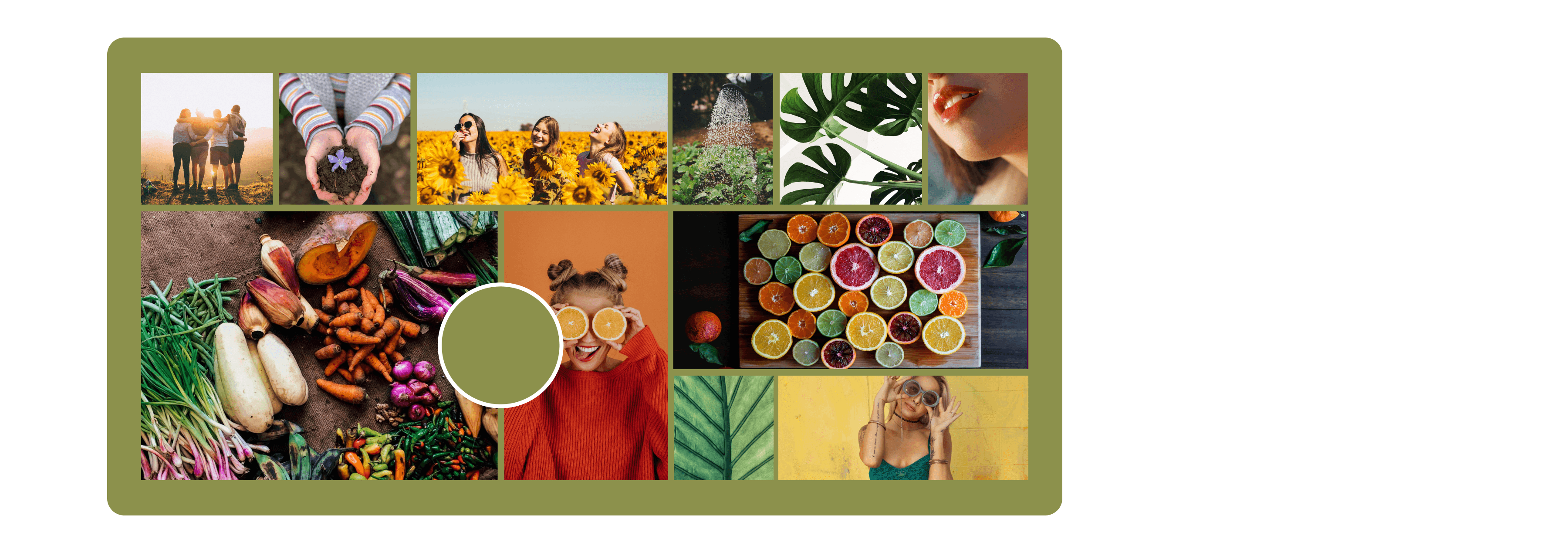
Moodboard
Our moodboard for The Juicery Store and Brand captures its essence by combining fresh smells, bright colors, and a friendly atmosphere. It also reflects the owner's vision of building an identity around healthiness, tastiness, sexiness, and friendliness, creating a cohesive user experience that resonates with the target audience.
Ideation
During our Ideation process we used several methods to gather innovative thoughts to enhance our protoype. here are a couple of my favourites, some of them were later implemented:
Monthly Drink: The "Drink of the Month," featuring a specially curated product with a unique story or seasonal twist. From refreshing smoothies to energizing juices, each month brings a new favorite for users to choose from.
Accessibility: Making the website available both in English and German including accessibility features like text-to-speech and color-blindness checks, using straightforward language.
Mood Curated-Drink: Users may discover their ideal drink. Personalized Path to Health, through Mood-Driven Smoothies and Quizzes.
Ingredient Path: Users learn about the product origin & their organic process. Why The Juicery chooses certain ingredients for health, and nutritional details.
Workshop collaboration ideas: Offer monthly health challenges with packages, including week-long juice cleanses. Collaborate with yoga shops for exclusive post-lesson promotions. Explore workshop opportunities for kids.
Userflow
To ensure a seamless navigation through our pages and not get lost in details, we defined a userflow. This helped us to keep track on which pages and functions we have to design to reach our goal.
Home Page
Start & Exit
About us Page
Pages (See)
User Actions (Do)
Menu Page
Pop up Mood-Drink Quiz
Mood Product Page
Pop up “Thank you for ordering”
Click On About us
Receive information about company
Click On Menu
Recognizes available product categories
Clicks on mood drink
Does mood quiz
Clicks on order & pick up
Legend :
Conclusion
Working with a real client is very exciting, especially when the owner is as nice as this one. We really enjoyed working together with The Juicery! Especially conducting the User Research interviews in the store itself was so much fun and we met many interesting people.
This project also teached me to be open for change - initially it was meant to be an e-commerce platform, but after talking tp the owner and the users we realized that a simple website would be better fitting. Our users don’t want to order online and get it delivered, they want to be on site in the store to soak in the vibe.
Let’s work together!
Coming Soon
Available in Desktop Version
The Juicery Berlin
Website Design
Let’s work together!
Let’s work together!