Macbay Digital
Website Redesign


Before we dive in...
I am very proud to say that my project partner and me won the Ironhack Berlin Hackshow March 2024 with the following project. This honor reflects our dedication and hard work, and we're thrilled to continue refining and implementing our project.

CLIENT
Macbay Digital
ROLE
UX Designer
UX Researcher
TIMELINE
9 days
TEAM
2 UX Designer
Before we dive in...
I am very proud to say that my project partner and me won the Ironhack Berlin Hackshow March 2024 with the following project. This honor reflects our dedication and hard work, and we're thrilled to continue refining and implementing our project.

Overview
Macbay, a provider of web hosting, web development, and online marketing based in Germany, faces a critical challenge: their website fails to effectively attract clients due to numerous issues. Despite serving a diverse clientele that includes small and medium-sized businesses as well as freelancers, the website's inadequacies prevent it from showcasing their services and attracting potential customers. Furthermore, the existence of three outdated domains compounds this problem, as they do not serve distinct purposes and contribute to a lack of clarity for visitors.
Goal
Our goal was to overhaul the website to ensure it was accessible and understandable to all visitors, especially given the complexity of web hosting. Simultaneously, we aimed to enhance the user interface to create a modern and engaging user experience.
Sneak Peek Protoype
Before we dive into the research, I'll be presenting a video showcasing our prototype. Throughout the presentation, I'll delve into our design choices and thought process, providing insights as we navigate through it together.
N°1
Visual Design and Readability Challenges:
Low contrast on the hero picture and distracting heading animations reduce readability and visual appeal.
N°2
Content Organization and Presentation:
Content overload, including lengthy sections and redundant information, overwhelms users and hampers information absorption.
N°3
Lack of Clarity and Consistency:
The website lacks a clear USP and fails to communicate its purpose effectively.
N°4
Poor Navigation and User Engagement:
Navigation issues, such as non-functional or unclear CTAs, lead to frustration and hinder user engagement.
N°5
Lack of Social Proof and Client Representation:
Absence of team representation and customer feedback diminishes trust and credibility.
N°6
Technical and Language Accessibility Issues:
Page loading time needs optimization, and the absence of a loading time counter contributes to user frustration.


Heuristic Evaluation & User Interviews
After conducting secondary research to deepen our understanding of web hosting, we conducted a heuristic evaluation based on Nielsen's principles and tested the current Macbay website with 7 users to identify flaws.
Both evaluations revealed numerous issues, and the findings from the heuristic evaluation closely matched the feedback from user testing, effectively guiding our improvement efforts.
Usability Testing: Before
During our user research, we found significant confusion among users regarding website navigation and locating essential information such as company details or various package options. To address these issues, we designed and tested UX Key Performance Indicators to demonstrate the improvements in user experience on the website without a complete redesign. We assigned users four different tasks based on the major pain points identified in our user interviews and heuristic evaluation. Users were expected to complete these tasks independently or with minimal assistance.
Due to the size of our testing group and the complexity of measuring task improvements, we opted to test the following KPIs:
Task sucess rate (TSR) = number of users completed the task / overall number of tested users
Time on task (ToT) = total time spent on task / number of tested users
🔎
Finding details about the company
Task success rate: 60%
Time on task: 43,6 s
💻
Setup a domain and
start a website
Task success rate: 80%
Time on task: 19 s
👀
Determine the difference
of hosting options
Task success rate: 20%
Time on task: 133 s
👌🏻
Check availability of the domain
Task success rate: 100%
Time on task: 11,8 s
The numbers revealed that users had faced considerable challenges in completing the assigned tasks. For example. only 20% of the users managed to tell the difference between the offered hosting options, which is a shocking result.
While this outcome had not been ideal for our client at the time, we had been confident that we could significantly improve by incorporating insights from our user research into our design approach. Between us: we got very excited to compare KPIs after the end result!
Later, after finishing our Prototype of the redesigned website, we tested the same people and KPIs again to be able to compare the results and measure our improvements. Be prepared to see massive shifts in numbers!
To round up our Task KPI, we also wanted to assess numerically how the overall user experience of the website felt to our tested users. We decided to conduct this assessment using a modified SUS scale.
SUS = our scale consisted of a 6-point questionnaire with five possible answers each, ranging from strongly agree to
strongly disagree
Question
The Information on the website was clear and helpful.
2. I found this website unnecessarily complex.
3. I thought this website was easy to use.
I thought there was lot of inconsistency on the website.
I felt confident using this website
I think I would need to know a lot of things before I get going with this website.
Strongly Agree
0 %
80 %
0 %
20 %
0 %
0 %
Agree
0 %
20 %
0 %
60 %
0 %
0 %
Neutral
0 %
0 %
0 %
20 %
20 %
20 %
Disagree
40 %
0 %
80 %
0 %
40 %
40 %
Strongly Disagree
60 %
0 %
20 %
0 %
40 %
40 %
Just as with the previous KPIs, it was evident that this site lacked usability. Users did not feel comfortable or well-navigated on the website.
Particularly considering the complex topic of web hosting, we immediately recognized the need for extensive changes to ensure an intuitive user experience on the website.
User Persona and User Journey
Based on the information gathered during the client interview, secondary research, and user research, we developed a user persona and their user journey to gain a deeper understanding of our target audience.
To avoid bias related to gender or age, we opted to keep our user persona neutral and refrained from using a picture of a real person or demographic information.
Goals:
Develop an online presence in form of a website
Possibility that interested clients can get in contact (mail/contact form)
Aesthetically pleasing and easy to use website system
Pain Points:
Is not familiar how the process of webhosting works and where to start
Doesn't have time to dive deep into the topic
Cannot spend a fortune on the website hosting
Motivations:
Kickstart their freelancing business.
Have a well working website to get a lot of clients
"I'm ready to take my freelancing career to the next level, but navigating web hosting and building a website feels like a intimidating task. I need a solution that's not only affordable but also helps me showcase my skills and attract clients effortlessly."
User Persona
The unexperienced Freelancer
•
They are really happy, because their business is growing
•
They want to expand their business even more now and looking for options how to attract more clients
•
Ex-colleagues from their previous workplace suggested that they check out Macbay services, as they worked with them and were happy with the outcome
•
They noticed that competitors from the same industry have websites to become more visible on the internet
•
They start to explore options the Macbay website, but got suck, because the information on the website is not well organized and confusing
•
They end up being frustrated without any solution on their hand
•
They feel dissapointed and upset
•
They need some advice from experts in this field, that’s why they are excited to explore Macbay as soon as possible to get the best solution for their situation
Happy
Neutral
Unhappy
Experience
😍
🤔
🤩
🥸
😵💫
😓
Problem Statement
To sum our research up, we gathered all the main problems we identified during the process:
The website poorly showcases the services macbay provide s
Potential clients experience frustration and confusion due to unclear information on the website
The design of the website is outdated
This resulted in the following problem statement:
Users struggle with setting up their websites due to not knowing much about web hosting, lack of time, and limited funds. They need a simple and affordable web hosting option to quickly build and manage their websites, helping them grow their businesses.
Therefore our goal was, as initially stated at the beginning of this case study, to make the website more visually appealing and accessible for users who are not familiar with the topic in order to enable them to efficiently create their presence online.
Usability Testing: After
True to our promise, we proceeded to test the same users with the same KPIs on our completed prototype. Maintaining consistency in subjects and measurements was crucial to ensure the validity and significance of our results.
Here are the results:
🔎
Finding details about the company
Task success rate: 100%
Time on task: 3,3 s
reduced by 40,3 s
💻
Setup a domain and
start a website
Task success rate: 100%
Time on task: 13,4 s
reduced by 5,6 s
👀
Determine the difference
of hosting options
Task success rate: 100%
Time on task: 5,2 s
reduced by 127,8 s
👌🏻
Check availability of the domain
Task success rate: 100%
Time on task: 1.6 s
reduced by 10,2 s
The results clearly show significant improvements across all four tasks in both measured KPIs. We achieved a 100% task success rate on each task and also significantly reduced the time spent on completing them.
Furthermore, we also tested our SUS scale once more:
Question
The Information on the website was clear and helpful.
2. I found this website unnecessarily complex.
3. I thought this website was easy to use.
I thought there was lot of inconsistency on the website.
I felt confident using this website
I think I would need to know a lot of things before I get going with this website.
Strongly Agree
80 %
0 %
60 %
0 %
80 %
0 %
Agree
20 %
0 %
40 %
0 %
20 %
0 %
Neutral
0 %
0 %
0 %
0 %
0 %
0 %
Disagree
0 %
40 %
0 %
20 %
0 %
60 %
Strongly Disagree
0 %
60 %
0 %
80 %
0 %
40 %
We observed dramatic shifts in the user experience, with our users now feeling confident and finding the website easy to navigate.
We were thrilled to witness such substantial changes and to showcase our improvements through compelling numbers.
Next Steps
Since UX Design is an iterative process, of course the work doesn’t stop here. These are the next steps we would take:
Graphics: Implement graphics instead of the pictures that are currently used
Detailed information: Implement more information on the “About us” page
Design adjustment: Finish designing the pages for the ‘other packages’ as well as ‘the services’
Numbers: Insert significant numbers for example how many clients macbay has, related to business success etc.
Key Learnings and Conclusion
It’s okay to fail and should rather be seen as an opportunity to grow
More user testing equals more valuable insights
KPI Testing helps to show improvements to the client, because shifts in numbers are easy to grasp
Working with a unfamiliar or hard to explain topic makes it hard to explain the content in just a few words, but it also gives you a fresh outlook
Let’s work together!
Macbay Digital
Website Redesign
Overview
Macbay, a provider of web hosting, web development, and online marketing based in Germany, faces a critical challenge: their website fails to effectively attract clients due to numerous issues. Despite serving a diverse clientele that includes small and medium-sized businesses as well as freelancers, the website's inadequacies prevent it from showcasing their services and attracting potential customers. Furthermore, the existence of three outdated domains compounds this problem, as they do not serve distinct purposes and contribute to a lack of clarity for visitors.
Click here to get directly to the Protoype Video
Goal
Our goal was to overhaul the website to ensure it was accessible and understandable to all visitors, especially given the complexity of web hosting. Simultaneously, we aimed to enhance the user interface to create a modern and engaging user experience.
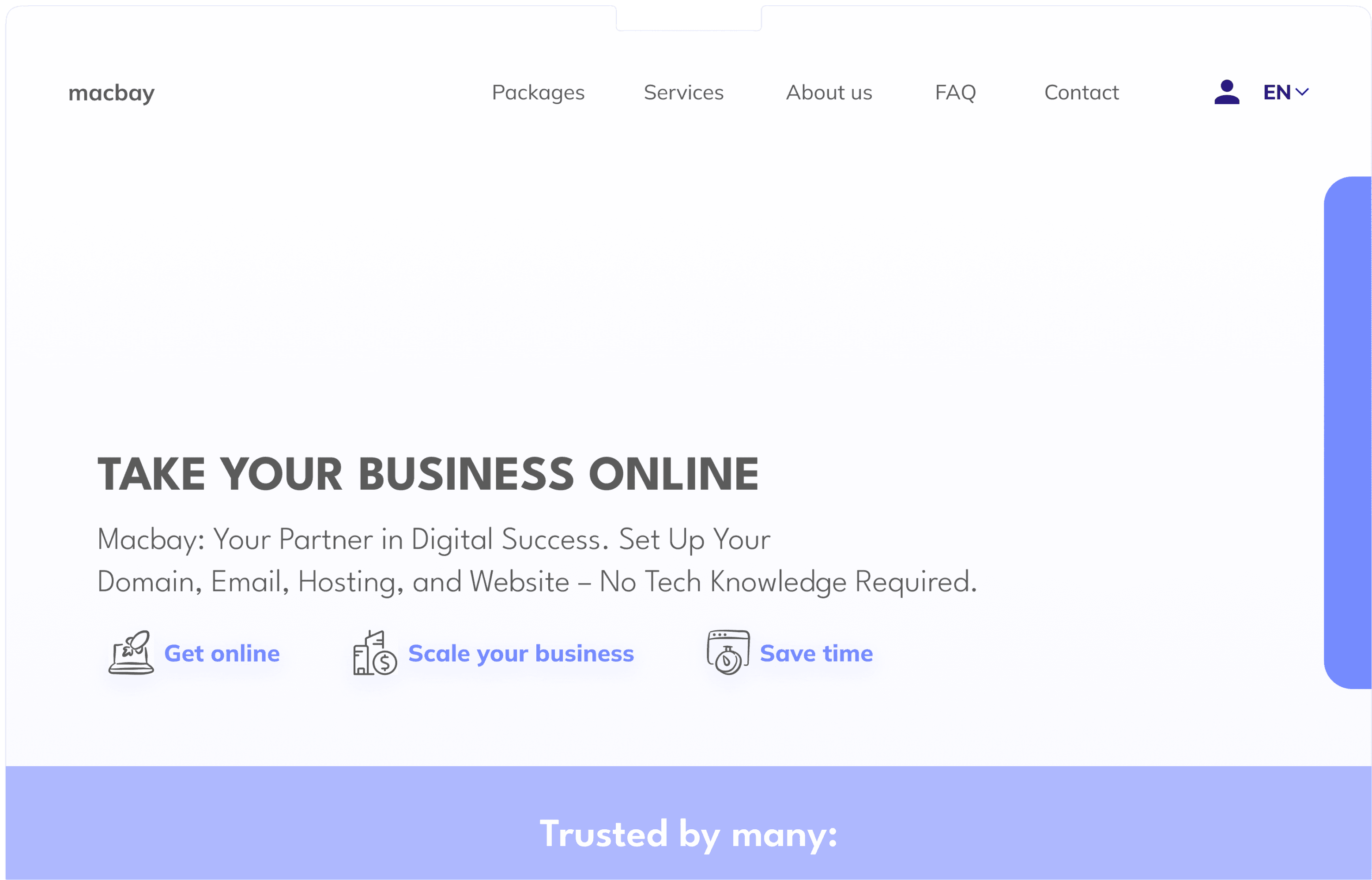
Heuristic Evaluation & User Interviews
After conducting secondary research to deepen our understanding of web hosting, we conducted a heuristic evaluation based on Nielsen's principles and tested the current Macbay website with 7 users to identify flaws.
Both evaluations revealed numerous issues, and the findings from the heuristic evaluation closely matched the feedback from user testing, effectively guiding our improvement efforts.

*Screenshot of original Website
N°1
Visual Design and Readability Challenges:
Low contrast on the hero picture and distracting heading animations reduce readability and visual appeal.
N°2
Content Organization and Presentation:
Content overload, including lengthy sections and redundant information, overwhelms users and hampers information absorption.
N°3
Lack of Clarity and Consistency:
The website lacks a clear USP
and fails to communicate its purpose effectively.
N°4
Poor Navigation and User Engagement:
Navigation issues, such as non-functional or unclear CTAs, lead to frustration and hinder user engagement.
N°5
Lack of Social Proof and Client Representation:
Absence of team representation and customer feedback diminishes trust and credibility.
N°6
Technical and Language Accessibility Issues:
Page loading time needs optimization, and the absence of a loading time counter contributes to user frustration.
Usability Testing: Before
During our user research, we found significant confusion among users regarding website navigation and locating essential information such as company details or various package options. To address these issues, we designed and tested UX Key Performance Indicators to demonstrate the improvements in user experience on the website without a complete redesign. We assigned users four different tasks based on the major pain points identified in our user interviews and heuristic evaluation. Users were expected to complete these tasks independently or with minimal assistance.
Due to the size of our testing group and the complexity of measuring task improvements, we opted to test the following KPIs:
Task sucess rate (TSR) = number of users completed the task / overall number of tested users
Time on task (ToT) = total time spent on task / number of tested users
🔎
Finding details about the company
Task success rate: 60%
Time on task: 43,6 s
💻
Setup a domain and
start a website
Task success rate: 80%
Time on task: 19 s
👀
Determine the difference
of hosting options
Task success rate: 20%
Time on task: 133 s
👌🏻
Check availability of the domain
Task success rate: 100%
Time on task: 11,8 s
Goals:
Develop an online presence in form of a website
Possibility that interested clients can get in contact (mail/contact form)
Aesthetically pleasing and easy to use website system
Pain Points:
Is not familiar how the process of webhosting works and where to start
Doesn't have time to dive deep into the topic
. Cannot spend a fortune on the website hosting
Motivations:
. Kickstart their freelancing business
. Have a well working website to get a lot of clients
User Persona
The unexperienced Freelancer
User Persona and User Journey
Based on the information gathered during the client interview, secondary research, and user research, we developed a user persona and their user journey to gain a deeper understanding of our target audience.
To avoid bias related to gender or age, we opted to keep our user persona neutral and refrained from using a picture of a real person or demographic information.
Problem Statement
To sum our research up, we gathered all the main problems we identified during the process:
The website poorly showcases the services macbay provide s
Potential clients experience frustration and confusion due to unclear information on the website
The design of the website is outdated
This resulted in the following problem statement:
Users struggle with setting up their websites due to not knowing much about web hosting, lack of time, and limited funds. They need a simple and affordable web hosting option to quickly build and manage their websites, helping them grow their businesses.
Therefore our goal was, as initially stated at the beginning of this case study, to make the website more visually appealing and accessible for users who are not familiar with the topic in order to enable them to efficiently create their presence online.
Prototype
Now, I'll be presenting a video showcasing our prototype. Throughout the presentation, I'll delve into our design choices and thought process, providing insights as we navigate through it together.
Usability Testing: After
True to our promise, we proceeded to test the same users with the same KPIs on our completed prototype. Maintaining consistency in subjects and measurements was crucial to ensure the validity and significance of our results.
Here are the results:
🔎
Finding details about the company
Task success rate: 100%
Time on task: 3,3 s
reduced by 40,3 s
💻
Setup a domain and
start a website
Task success rate: 100%
Time on task: 13,4 s
reduced by 5,6 s
👀
Determine the difference
of hosting options
Task success rate: 100%
Time on task: 5,2 s
reduced by 127,8 s
👌🏻
Check availability of the domain
Task success rate: 100%
Time on task: 1.6 s
reduced by 10,2 s
The numbers revealed that users had faced considerable challenges in completing the assigned tasks. For example. only 20% of the users managed to tell the difference between the offered hosting options, which is a shocking result.
While this outcome had not been ideal for our client at the time, we had been confident that we could significantly improve by incorporating insights from our user research into our design approach.
Between us: we got very excited to compare KPIs after the end result!
Later, after finishing our Prototype of the redesigned website, we tested the same people and KPIs again to be able to compare the results and measure our improvements. Be prepared to see massive shifts in numbers!
The results clearly show significant improvements across all four tasks in both measured KPIs. We achieved a 100% task success rate on each task and also significantly reduced the time spent on completing them.
Next Steps
Since UX Design is an iterative process, of course the work doesn’t stop here. These are the next steps we would take:
Graphics: Implement graphics instead of the pictures that are currently used
Detailed information: Implement more information on the “About us” page
Design adjustment: Finish designing the pages for the ‘other packages’ as well as ‘the services’
Numbers: Insert significant numbers for example how many clients macbay has, related to business success etc.
Key Learnings and Conclusion
It’s okay to fail and should rather be seen as an opportunity to grow
More user testing equals more valuable insights
KPI Testing helps to show improvements to the client, because shifts in numbers are easy to grasp
Working with a unfamiliar or hard to explain topic makes it hard to explain the content in just a few words, but it also gives you a fresh outlook
Let’s work together!
Let’s work together!
CLIENT
Macbay Digital
ROLE
UX Designer
UX Researcher
TIMELINE
9 days
TEAM
2 UX Designer